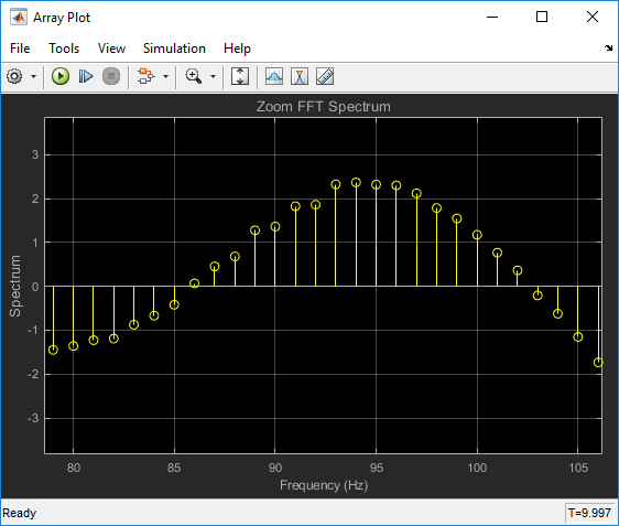
Array Plot
Display vectors or arrays
- Library:
DSP System Toolbox / Sinks

Description
The Array Plot block plots vectors or arrays of data. It is a vector plot where data is uniformly spaced along the x-axis. You can specify the spacing to use with the Sample Increment property.
Ports
Input
Properties
Configuration Properties
The Configuration Properties dialog box controls various properties about the
scope displays. To open the configuration properties dialog box, select View > Configuration Properties. Alternatively, in the toolbar, click the Configuration Properties
![]() button.
button.
X-data mode — Type of x-axis spacing
Sample increment and
                                X-offset
(default) | Custom
Select the type of spacing to use between x-axis data values.
- Sample increment and X-offset
Use the Sample increment and X-offset values to specify x-axis data.
- Custom
Specify a custom spacing using the Custom X-data property.
Programmatic Use
See XDataMode.
Sample increment — Spacing between samples
1 (default) | finite scalar
Specify the spacing between samples along the x-axis as a finite numeric scalar. The input signal is only y-axis data. x-axis data is set automatically based on both the Sample increment and X-offset values. For example, when X-offset is 0 and Sample increment is 1, the x-axis data for the input signal is set to 0, 1, 2, 3, 4, … . If you set Sample increment to 0.25, the x-axis data becomes 0, 0.25, 0.5, 0.75, 1, … .
Tunable: Yes
Dependency
To use this property, set X-data mode
to Sample increment and X-offset.
Programmatic Use
See SampleIncrement.
X-offset — x-axis offset
0 (default) | scalar
Specify the offset to apply to the x-axis, as a numeric scalar. x-axis data is set automatically based on both the Sample increment and X-offset values. The offset represents the first value on the x-axis. For example, when X-offset is 0 and Sample increment is 1, the x-axis data for the input signal is set to 0, 1, 2, 3, 4, … . If you set X-offset to -3, the x-axis data becomes -3, -2, -1, 0, 1, … .
Tunable: Yes
Dependency
To use this property, set X-data mode
to Custom.
Programmatic Use
See XOffset.
Custom X-data — x-axis data values
empty vector (default) | vector with length equal to the input frame length
Specify the x-axis data values as a vector of
length equal to the frame length of the inputs. This property is
displayed only if the X-data mode
property is Custom. If you use the default
(empty vector) value, the x-axis data is uniformly
spaced over the interval (0:L-1), where
L is the frame length.
Example: A custom logarithmic x-axis data scaling is
[0:log10(44100/2):1024]
Tunable: Yes
Programmatic Use
See CustomXData.
X-axis scale — x-axis scale
Linear (default) | Log
Select Linear or
Log as the x-axis
scale. If X-offset is a negative value, you cannot
set X-axis scale to Log.
Tunable: Yes
Programmatic Use
See XScale.
Y-axis scale — y-axis scale
Linear (default) | Log
Maximize axes — Maximize size of plots
Auto (default) | Off | On
Title — Display name
%<SignalLabel> (default) | string
Specify a title for display. The default value
%<SignalLabel> uses the input signal name
for the title.
Tunable: Yes
Programmatic Use
See Title
Show legend — Display signal legend
off (default) | on
Toggle signal legend. The names listed in the legend are the signal names from the model. For signals with multiple channels, a channel index is appended after the signal name. Continuous signals have straight lines before their names, and discrete signals have step-shaped lines.
From the legend, you can control which signals are visible. This control is equivalent to changing the visibility in the Style properties. In the scope legend, click a signal name to hide the signal in the scope. To show the signal, click the signal name again. To show only one signal, right-click the signal name, which hides all other signals. To show all signals, press Esc.
Note
The legend only shows the first 20 signals. Any additional signals cannot be controlled from the legend.
Tunable: Yes
Programmatic Use
See ShowLegend
Show grid — Show internal grid lines
on (default) | off
Plot signals as magnitude and phase — Split display into magnitude and phase plots
off (default) | on
On - Display magnitude and phase plots. If the signal is real, the scope plots the absolute value of the signal for the magnitude. The phase is 0 degrees for positive values and 180 degrees for negative values. This feature is useful for complex-valued input signals. If the input is a real-valued signal, selecting this check box returns the absolute value of the signal for the magnitude.
Off - Display signal plot. If the signal is complex, the scope plots the real and imaginary parts on the same y-axis.
Tunable: Yes
Programmatic Use
See PlotAsMagnitudePhase.
X-label — x-axis label
none (default) | string
Specify the text for the scope to display below the x-axis.
Tunable: Yes
Programmatic Use
See XLabel.
Y-label — Y-axis label
none (default) | string
Specify the text to display on the y-axis. To
display signal units, add (%<SignalUnits>) to
the label. At the beginning of a simulation, Simulink® replaces (%SignalUnits) with the units
associated with the signals.
Example: For a velocity signal with units of m/s,
enter Velocity (%<SignalUnits>).
Tunable: Yes
Dependency
If you select Plot signals as magnitude and
phase, this property does not apply. The
y-axes are labeled
Magnitude and
Phase.
Programmatic Use
See YLabel
Y-limits (Minimum) — Minimum y-axis value
-10 (default) | real scalar
Specify the minimum value of the y-axis as a real number.
Tunable: Yes
Dependency
If you select Plot signals as magnitude and phase, this property only applies to the magnitude plot. The y-axis limits of the phase plot are always [-180,180].
Programmatic Use
See YLimits
Y-limits (Maximum) — Maximum y-axis value
10 (default) | real scalar
Specify the maximum value of the y-axis as a real number.
Tunable: Yes
Dependency
If you select Plot signals as magnitude and phase, this property only applies to the magnitude plot. The y-axis limits of the phase plot are always [-180,180].
Programmatic Use
See YLimits
Axes Scaling Properties
The Axes Scaling properties control the axes limits of the Array Plot. To open the Axes Scaling properties, in the Array Plot menu, select Tools > Axes Scaling > Axes Scaling Properties.
Axes scaling — Y-axis scaling mode
Manual (default) | Auto | After N Updates
Manual- Manually scale y-axis range with Scale Y-axis Limits toolbar button.Auto- Scale y-axis range during and after simulation. Selecting this option displays the Do not allow Y-axis limits to shrink check box.If you want the y-axis range to increase and decrease with the maximum value of a signal, set Axes scaling to
Autoand clear the Do not allow Y-axis limits to shrink check box.After N Updates- Scale y-axis after the number of time steps specified in the Number of updates text box (10by default). Scaling occurs only once during each run.
Tunable: Yes
Programmatic Use
See AxesScaling
Do not allow Y-axis limits to shrink — How y-axis limits can change
on (default) | off
On - Allow y-axis range limits to increase but not decrease during a simulation.
Off - Allow y-axis range limits to increase and decrease.
Tunable: Yes
Dependency
To enable this property, set Axes scaling to
Auto.
Number of updates — Number of updates before scaling
10 (default) | integer
Set this property to delay auto scaling the y-axis.
Tunable: Yes
Dependency
To enable this property, set Axes scaling
to After N Updates.
Programmatic Use
Scale axes limits at stop — When y-axis limits can change
on (default) | off
On - Scale axes when simulation stops.
Off - Scale axes continually.
Tunable: Yes
Y-axis Data range (%) — Percent of y-axis to plot on
80 (default) | integer between [1, 100]
Specify percentage of y-axis range for plotting data. For example, if you set
this property to 100, plotted data uses the entire y-axis
range.
Tunable: Yes
Y-axis Align — Alignment along y-axis
Center (default) | Top | Bottom
Specify where to align plotted data along the y-axis data range when Y-axis Data range is set to less than 100 percent.
Top- Align signals with maximum values at top of y-axis range.Center- Center signals between minimum and maximum values.Bottom- Align signals with minimum values at bottom of y-axis range.
Tunable: Yes
Style
Open the Style dialog box by selecting View > Style or the Style button (![]() ) in the dropdown below the Configuration
Properties gear icon. In this dialog box, you can change the figure colors,
background axes colors, foreground axes colors, and properties of lines in a
display.
) in the dropdown below the Configuration
Properties gear icon. In this dialog box, you can change the figure colors,
background axes colors, foreground axes colors, and properties of lines in a
display.
Figure color — Background color for window
black (default) | color
Background color for the scope
Tunable: Yes
Plot type — Type of plot
Stem (default) | Stairs | Line
Line- Line graphStairs- Stair-step graphStem- Stem graph
Tunable: Yes
Programmatic Use
See PlotType.
Axes colors — Background and axes color for individual displays
black (default) | color
Select the background color for axes (displays) with the first color palette. Select the grid and label color with the second color palette.
Properties for line — Line to change
Channel 1 (default)
Select active line for setting line style properties.
Tunable: Yes
Visible — Line visibility
on (default) | off
Show or hide a signal on the plot.
Tunable: Yes
Dependency
The Properties for line property determines which line is affected.
Line — Line style
style | width | color
Select line style, width, and color.
Tunable: Yes
Dependency
The Properties for line property determines which line is affected.
Marker — Data point marker style
None (default) | marker shape
Select marker style.
Tunable: Yes
Dependency
The Properties for line property determines which line is affected.
Model Examples


Block Characteristics
Data Types |
|
Direct Feedthrough |
|
Multidimensional Signals |
|
Variable-Size Signals |
|
Zero-Crossing Detection |
|
Extended Capabilities
See Also
Blocks
Objects
Topics
- Array Plot with Apple iOS Devices (Simulink Support Package for Apple iOS Devices)
- Array Plot with Android Devices