Scatter plot with marginal histograms
scatterhist(
creates
the plot using additional options specified by one or more name-value
pair arguments. For example, you can specify a grouping variable or
change the display options.x
,y
,Name,Value
)
scatterhist
PlotLoad the sample data. Create data vector x
from the
first column of the data matrix, which contains sepal length measurements
from iris flowers. Create data vector y
from the second
column of the data matrix, which contains sepal width measurements from the
same flowers.
load fisheriris.mat;
x = meas(:,1);
y = meas(:,2);
Create a scatter plot and two marginal histograms to visualize the relationship between sepal length and sepal width.
scatterhist(x,y)
Display a data tip for a bin in a histogram. A data tip appears when you hover over a bin in a histogram.
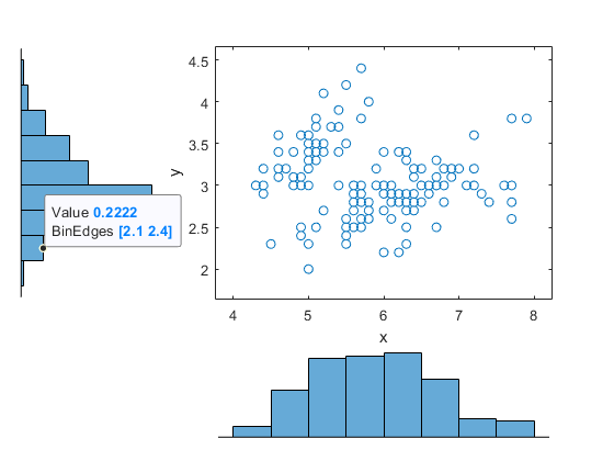
The data tip displays the probability density function estimate of the selected bin and the lower and upper values for the bin edges.
Load the sample data. Create data vector x
from the first column of the data matrix, which contains sepal length measurements from three species of iris flowers. Create data vector y
from the second column of the data matrix, which contains sepal width measurements from the same flowers.
load fisheriris.mat;
x = meas(:,1);
y = meas(:,2);
Create a scatter plot and six kernel density plots to visualize the relationship between sepal length and sepal width, grouped by species.
scatterhist(x,y,'Group',species,'Kernel','on')
The plot shows that the relationship between sepal length and width varies depending on the flower species.
Load the sample data. Create data vector x
from the first column of the data matrix, which contains sepal length measurements from three different species of iris flowers. Create data vector y
from the second column of the data matrix, which contains sepal width measurements from the same flowers.
load fisheriris.mat;
x = meas(:,1);
y = meas(:,2);
Create a scatter plot and six kernel density plots to visualize the relationship between sepal length and sepal width as measured on three species of iris flowers, grouped by species. Customize the appearance of the plots.
scatterhist(x,y,'Group',species,'Kernel','on','Location','SouthEast',... 'Direction','out','Color','kbr','LineStyle',{'-','-.',':'},... 'LineWidth',[2,2,2],'Marker','+od','MarkerSize',[4,5,6]);
Load the sample data. Create data vector x
from the first column of the data matrix, which contains sepal length measurements from three species of iris flowers. Create data vector y
from the second column of the data matrix, which contains sepal width measurements from the same flowers.
load fisheriris.mat;
x = meas(:,1);
y = meas(:,2);
Use axis handles to replace the marginal histograms with box plots.
h = scatterhist(x,y,'Group',species); hold on; clr = get(h(1),'colororder'); boxplot(h(2),x,species,'orientation','horizontal',... 'label',{'','',''},'color',clr); boxplot(h(3),y,species,'orientation','horizontal',... 'label', {'','',''},'color',clr); set(h(2:3),'XTickLabel',''); view(h(3),[270,90]); % Rotate the Y plot axis(h(1),'auto'); % Sync axes hold off;
scatterhist
Plot in a Specified Parent ContainerLoad the sample data. Create data vector x
from the first column of the data matrix, which contains sepal length measurements from iris flowers. Create data vector y
from the second column of the data matrix, which contains sepal width measurements from the same flowers.
load fisheriris
x = meas(:,1);
y = meas(:,2);
Create a new figure and define two uipanel
objects to divide the figure into two parts. In the upper half of the figure, plot the sample data using scatterhist
. Include marginal kernel density plots grouped by species. In the lower half of the figure, plot a histogram of the sepal length measurements contained in x
.
figure hp1 = uipanel('position',[0 .5 1 .5]); hp2 = uipanel('position',[0 0 1 .5]); scatterhist(x,y,'Group',species,'Kernel','on','Parent',hp1); axes('Parent',hp2); hist(x);
x
— Sample dataSample data, specified as a vector. The data vectors x
and y
must
be the same length.
If x
or y
contain NaN
values,
then scatterhist
:
Removes rows with NaN
values in
either x
or y
from both
data vectors when generating the scatter plot
Removes rows with NaN
values only
from the corresponding x
or y
data
vector when generating the marginal histograms
Data Types: single
| double
y
— Sample dataSample data, specified as a vector. The data vectors x
and y
must
be the same length.
If x
or y
contain NaN
values,
then scatterhist
:
Removes rows with NaN
values in
either x
or y
from both
data vectors when generating the scatter plot
Removes rows with NaN
values only
from the corresponding x
or y
data
vector when generating the marginal histograms
Data Types: single
| double
Specify optional
comma-separated pairs of Name,Value
arguments. Name
is
the argument name and Value
is the corresponding value.
Name
must appear inside quotes. You can specify several name and value
pair arguments in any order as
Name1,Value1,...,NameN,ValueN
.
'Location','SouthEast','Direction','out'
specifies
a plot with histograms located below and to the right of the scatter
plot, with the bars directed away from the scatter plot.'NBins'
— Number of bins for histogramsNumber of bins for histograms, specified as the comma-separated
pair consisting of 'NBins'
and a positive integer
value greater than or equal to 2, or vector of two such values. If
the number of bins is specified as a positive integer value, that
value is the number of bins for both the x
and y
histograms.
If the number of bins is specified by a vector, the first value is
the number of bins for the x
data, and the second
value is the number of bins for the y
data. By
default, the number of bins is computed based on the sample standard
deviation using Scott’s rule.
Example: 'NBins',[5,7]
Data Types: single
| double
'Location'
— Location of marginal histograms'SouthWest'
(default) | 'SouthEast'
| 'NorthEast'
| 'NorthWest'
Location of the marginal histograms in the figure, specified
as the comma-separated pair consisting of 'Location'
and
one of the following.
'SouthWest' | Plot the histograms below and to the left of the scatter plot. |
'SouthEast' | Plot the histograms below and to the right of the scatter plot. |
'NorthEast' | Plot the histograms above and to the right of the scatter plot. |
'NorthWest' | Plot the histograms above and to the left of the scatter plot. |
Example: 'Location','SouthEast'
'Direction'
— Direction of marginal histograms'in'
(default) | 'out'
Direction of the marginal histograms, specified as the comma-separated
pair consisting of 'Direction'
and one of the following.
'in' | Plot the histograms with the bars directed toward the scatter plot. |
'out' | Plot the histograms with the bars directed away from the scatter plot. |
Example: 'Direction','out'
'Group'
— Grouping variableGrouping variable, specified as the comma-separated pair consisting of
'Group'
and a categorical array, logical or
numeric vector, character array, string array, or cell array of
character vectors. Each unique value in a grouping variable defines a
group.
For example, if Gender
is a cell array of character
vectors with values 'Male'
and
'Female'
, you can use Gender
as a grouping variable to plot your data by gender.
The number of rows in the grouping variable must be equal to the
length of x
.
Example: 'Group',Gender
Data Types: categorical
| single
| double
| logical
| char
| string
| cell
'PlotGroup'
— Grouped plot indicator'on'
| 'off'
Grouped plot indicator, specified as the comma-separated pair
consisting of 'PlotGroup'
and one of the following.
'on' | Display grouped histograms or grouped kernel density plots.
This is the default if a Group parameter is specified. |
'off' | Display histograms or kernel density plots of the whole data
set. This is the default if a Group parameter
is not specified. |
Example: 'PlotGroup','off'
'Style'
— Histogram display style'stairs'
| 'bar'
Histogram display style, specified as the comma-separated pair
consisting of 'PlotGroup'
and one of the following.
'stairs' | Display a stairstep plot that shows the outline of the histogram without filling the bars. This is the default if you specify a grouping variable that contains more than one group. |
'bar' | Display a histogram bar plot. This is the default if you specify
a grouping variable that contains only one group or if PlotGroup is
specified as 'off' . |
Example: 'Style','bar'
'Kernel'
— Kernel density plot indicator'off'
(default) | 'on'
| 'overlay'
Kernel density plot indicator, specified as the comma-separated
pair consisting of 'Kernel'
and one of the following.
'off' | Display the marginal distributions as histograms. |
'on' | Display the marginal distributions as kernel density plots. |
'overlay' | Display the marginal distributions as kernel density plots
overlaid onto histograms, similar to histfit . |
Example: 'Kernel','overlay'
'Bandwidth'
— Bandwidth of kernel smoothing windowBandwidth of kernel smoothing window, specified as the comma-separated
pair consisting of 'Bandwidth'
and a matrix of
size 2-by-K, where K is the
number of unique groups. The first row of the matrix gives the bandwidth
of each group in x
, and the second row gives the
bandwidth of each group in y
. By default, scatterhist
finds
the optimal bandwidth for estimating normal densities. Specifying
a different bandwidth value changes the smoothing characteristics
of the resulting kernel density plot. The value specified is a scaling
factor for the normal distribution used to generate the kernel density
plot.
Example: 'Bandwidth',[.5,.2,.1;.15,.25,.35]
Data Types: single
| double
'Legend'
— Legend visibility indicator'on'
| 'off'
Legend visibility indicator, specified as the comma-separated
pair consisting of 'Legend'
and one of the following.
'on' | Set legend visible. This is the default if a Group parameter
is specified. |
'off' | Set legend invisible. This is the default if a Group parameter
is not specified. |
Example: 'Legend','on'
'Parent'
— Parent container of the plotuipanel
container object | figure
container object'LineStyle'
— Style of kernel density plot lineStyle of kernel density plot line, specified as the comma-separated pair consisting of
'LineStyle'
and a valid line style or a string
array or cell array of valid line styles. See plot
for valid line
styles. The default is a solid line. Use a string array or cell array to
specify different line styles for each group. When the total number of
groups exceeds the number of specified values,
scatterhist
cycles through the specified
values.
Example: 'LineStyle',{'-',':','-.'}
Data Types: char
| string
| cell
'LineWidth'
— Width of kernel density plot line0.5
(default) | nonnegative scalar value | vectorWidth of kernel density plot line, specified as the comma-separated
pair consisting of 'LineWidth'
and a nonnegative
scalar value or vector of nonnegative scalar values. The specified
value is the size of the kernel density plot line measured in points.
The default size is 0.5 points. Use a vector to specify different
line widths for each group. When the total number of groups is greater
than the number of specified values, scatterhist
cycles
through the specified values.
Example: 'LineWidth',[0.5,1,2]
Data Types: single
| double
'Color'
— Marker color for each scatter plot groupMarker color for each scatter plot group, specified as the comma-separated pair consisting of
'Color'
and a character vector or string scalar
of color names, or a three-column matrix of RGB values in the range
[0,1]. If you specify colors using a matrix, then each row of the matrix
is an RGB triplet that represents a group. The three columns of the
matrix represent the R value, G value, and B value, respectively. When
the total number of groups exceeds the number of specified colors,
scatterhist
cycles through the specified
colors.
This table lists the predefined colors and their equivalent RGB triplet values.
Option | Description | Equivalent RGB Triplet |
---|---|---|
'red' or
'r' | Red | [1 0 0] |
'green' or
'g' | Green | [0 1 0] |
'blue' or
'b' | Blue | [0 0 1] |
'yellow' or
'y' | Yellow | [1 1 0] |
'magenta' or
'm' | Magenta | [1 0 1] |
'cyan' or
'c' | Cyan | [0 1 1] |
'white' or
'w' | White | [1 1 1] |
'black' or
'k' | Black | [0 0 0] |
Example: 'Color','kcm'
Example: 'Color',[.5,0,1;0,.5,.5]
Data Types: single
| double
| char
| string
'Marker'
— Marker symbol for each scatterplot group'o'
(default) | character vector | string scalarMarker symbol for each scatter plot group, specified as the comma-separated pair consisting of
'Marker'
and a character vector or string scalar
of one or more valid marker symbols. See plot
for valid symbols.
The default is 'o'
, a circle. When the total number
of groups exceeds the number of specified symbols,
scatterhist
cycles through the specified
symbols.
Example: 'Marker','+do'
Data Types: char
| string
'MarkerSize'
— Marker size for each scatter plot group6
(default) | nonnegative scalar value | vectorMarker size for each scatter plot group, specified as the comma-separated
pair consisting of 'MarkerSize'
and a nonnegative
scalar value or a vector of nonnegative scalar values, measured in
points. When the total number of groups exceeds the number of specified
values, scatterhist
cycles through the specified
values.
Example: 'MarkerSize',10
Data Types: single
| double
h
— Axes handlesAxes handles for the three plots, returned as a vector. The vector contains the handles for the scatter plot, the histogram along the horizontal axis, and the histogram along the vertical axis, respectively.
Alternatively, you can create a ScatterHistogramChart
object by
using the scatterhistogram
function.
Explore the data interactively in the object by panning, zooming, and
using data tips. Unlike the scatterhist
function,
scatterhistogram
updates the marginal histograms
based on the data within the current scatter plot limits.
Control the appearance and behavior of the scatter histogram chart by changing the ScatterHistogramChart Properties.
You have a modified version of this example. Do you want to open this example with your edits?