Modify Figures in Live Scripts
You can modify figures interactively in the Live Editor. Use the provided tools to explore data and add formatting, annotations, or additional axes to your figures. Then, update your code to reflect changes using the generated code.
Explore Data
You can pan, zoom, and rotate a figure in your script using the tools that appear in the upper-right corner of the figure axes when you hover over the figure.
 — Add data tips to display data
values.
— Add data tips to display data
values. — Rotate the plot (3-D plots
only).
— Rotate the plot (3-D plots
only). — Pan the plot.
 ,
,  — Zoom in and out of the
plot.
— Zoom in and out of the
plot. — Undo all pan, zoom, and rotate
actions and restore the original view of the plot.
— Undo all pan, zoom, and rotate
actions and restore the original view of the plot.
To undo or redo an action, click ![]() or
or ![]() at the upper right corner of the
toolstrip.
at the upper right corner of the
toolstrip.
Note
When you open a saved live script,
 appears next to each output figure,
indicating that the interactive tools are not available yet. To make
these tools available, run the live script.
appears next to each output figure,
indicating that the interactive tools are not available yet. To make
these tools available, run the live script.The interactive tools are not available for invisible axes.
Suppose that you want to explore the health information for 100 different
patients. Create a live script called patients.mlx and add code
that loads the data and adds a scatter plot that shows the height versus weight of
two groups of patients, female and male. Run the code by going to the Live
Editor tab and clicking ![]() Run.
Run.
load patients

figure
Gender = categorical(Gender);
scatter(Height(Gender=='Female'),Weight(Gender=='Female'));
hold on
scatter(Height(Gender=='Male'),Weight(Gender=='Male'));
hold off

Explore the points where the patient height is 64 inches. Select the ![]() button and click one of the data points where
height is 64. MATLAB® zooms into the figure.
button and click one of the data points where
height is 64. MATLAB® zooms into the figure.

Update Code with Figure Changes
When modifying output figures in live scripts, changes to the figure are not automatically added to the script. With each interaction, MATLAB generates the code needed to reproduce the interactions and displays this code either underneath or to the right of the figure. Use the Update Code button to add the generated code to your script. This ensures that the interactions are reproduced the next time you run the live script.
For example, in the live script patients.mlx, after zooming in
on patients with a height of 64, click the Update Code
button. MATLAB adds the generated code after the line containing the code for
creating the
plot.
xlim([61.31 69.31])
ylim([116.7 183.3])
Add Formatting and Annotations
In addition to exploring the data, you can format and annotate your figures
interactively by adding titles, labels, legends, grid lines, arrows, and lines. To
add an item, first select the desired figure. Then, go to the
Figure tab and, in the Annotations
section, select one of the available options. Use the down arrow on the right side
of the section to display all available annotations. To add a formatting or
annotation option to your favorites, click the star at the top right of the desired
annotation button. To undo or redo a formatting or annotation action, click ![]() or
or ![]() at the upper right corner of the
toolstrip.
at the upper right corner of the
toolstrip.
Annotation options include:
 Title — Add a
title to the axes. To modify an existing title, click the existing title and
enter the modified text.
Title — Add a
title to the axes. To modify an existing title, click the existing title and
enter the modified text. X-Label,
 Y-Label — Add
a label to the axes. To modify an existing label, click the existing label
and enter the modified text.
Y-Label — Add
a label to the axes. To modify an existing label, click the existing label
and enter the modified text. Legend — Add a
legend to the figure. To modify the existing legend descriptions, click the
existing descriptions and enter the modified text. Select Remove
Legend from the Annotations section to
remove the legend from the axes.
Legend — Add a
legend to the figure. To modify the existing legend descriptions, click the
existing descriptions and enter the modified text. Select Remove
Legend from the Annotations section to
remove the legend from the axes. Colorbar — Add
a color bar legend to the figure. Select Remove
Colorbar from the Annotations section to
remove the color bar legend from the axes.
Colorbar — Add
a color bar legend to the figure. Select Remove
Colorbar from the Annotations section to
remove the color bar legend from the axes. Grid,
Grid,
 X-Grid,
 Y-Grid — Add
grid lines to the figure. Select Remove Grid from the
Annotations section to remove all the grid lines
from the axes.
Y-Grid — Add
grid lines to the figure. Select Remove Grid from the
Annotations section to remove all the grid lines
from the axes. Line,
Line,
 Arrow,
 Text Arrow,
 Double Arrow —
Add a line or arrow annotation to the figure. Draw the arrow from tail to
head. To move an existing annotation, click the annotation to select it and
drag it to the desired location. Press the Delete key to
delete the selected annotation.
Double Arrow —
Add a line or arrow annotation to the figure. Draw the arrow from tail to
head. To move an existing annotation, click the annotation to select it and
drag it to the desired location. Press the Delete key to
delete the selected annotation.
Note
Adding formatting and annotations using the Figure tab is not supported for invisible axes.
For example, suppose that you want to add formatting and annotations to the figure
in patients.mlx.
Add a title — In the Annotations section, select
Title. A blue
rectangle appears prompting you to enter text. Type the text Weight vs. Heightand press Enter.Add X and Y Labels — In the Annotations section, select
X-Label. A blue
rectangle appears prompting you to enter text. Type the text
Heightand press Enter. SelectY-Label. A blue
rectangle appears prompting you to enter text. Type the text
Weightand press Enter.Add a legend — In the Annotations section, select
Legend. A legend
appears at the top right corner of the axes. Click the
data1description in the legend and replace the text withFemale. Click thedata2description in the legend and replace the text withMale. Press Enter.Add grid lines — In the Annotations section, select
Grid. Grid lines
appear in the axes.Add an arrow annotation — In the Annotations section, select
Text Arrow. Drawing
the arrow from tail to head, position the arrow on the scatter plot pointing
to the lightest patient. Enter the text Lightest Patientand press EnterUpdate the code — In the selected figure, click the Update Code button. The live script now contains the code needed to reproduce the figure changes.
grid on
legend({'Female','Male'})
title('Weight vs Height')
xlabel('Height')
ylabel('Weight')
annotation('textarrow',[0.455 0.3979],[0.3393 0.13],'String','Lightest Patient');

Add and Modify Multiple Subplots
You can combine multiple plots by creating subplots in a figure. To add multiple
subplots to your figure, use the Subplot button to divide the
figure into a grid of subplots. First, select the desired figure. Then, go to the
Figure tab and choose a subplot layout using the
Subplot![]() button. You only can add additional subplots to a
figure if the figure contains one subplot. If a figure contains multiple subplots,
the Subplot button is disabled.
button. You only can add additional subplots to a
figure if the figure contains one subplot. If a figure contains multiple subplots,
the Subplot button is disabled.
For example, suppose that you want to compare the blood pressure of smoking and
non-smoking patients. Create a live script called
patients_smoking.mlx and add code that loads the health
information for 100 different patients.
load patients
Run the code by going to the Live Editor tab and clicking
![]() Run.
Run.
Add a scatter plot that shows the systolic blood pressure of patients that smoke versus the systolic blood pressure of patients that do not smoke. Run the code.
figure
scatter(Age(Smoker==1),Systolic(Smoker==1));
hold on
scatter(Age(Smoker==0),Systolic(Smoker==0));
hold off
In the Figure tab, select
Subplot![]() and choose the layout for two horizontal graphs.
and choose the layout for two horizontal graphs.
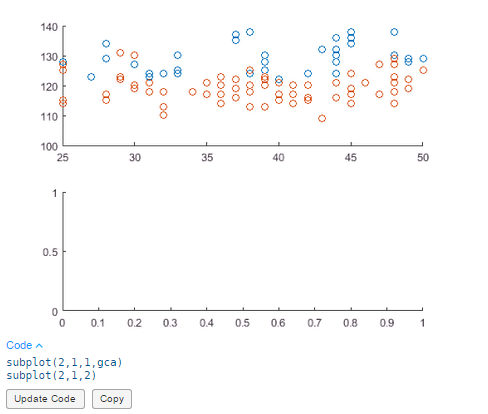
In the newly created figure, click the Update Code button. The live script now contains the code needed to reproduce the two subplots.
subplot(2,1,1,gca)
subplot(2,1,2)
Add a scatter plot that shows the diastolic blood pressure of patients that smoke versus the diastolic blood pressure of patients that do not smoke. Run the code.
scatter(Age(Smoker==1),Diastolic(Smoker==1));
hold on
scatter(Age(Smoker==0),Diastolic(Smoker==0));
hold off
Add formatting:
Add titles to each subplot — In the Annotations section, select
Title. A blue
rectangle appears in each subplot prompting you to enter text. Type the text
Systolic Blood Pressure of Smokers vs Non-Smokersin the first subplot andDiastolic Blood Pressure of Smokers vs Non-Smokersin the second subplot and press Enter.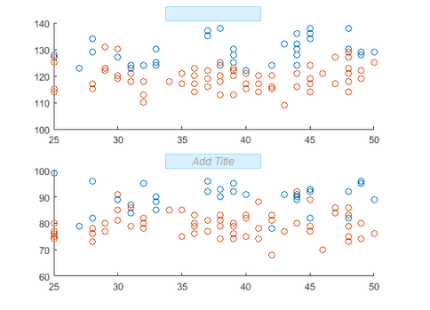
Add grid lines to each subplot — In the Annotations section, select
Grid. An
Add Grid button appears on each subplot. Click
the Add Grid button on each subplot. Grid lines
appear in both subplots.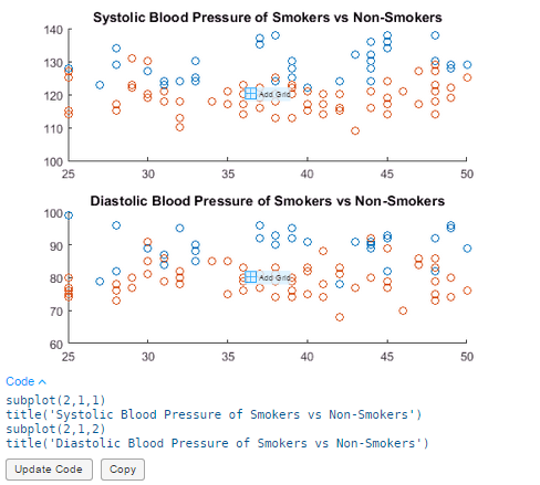
Update the code — In the selected figure, click the Update Code button. The live script now contains the code needed to reproduce the figure changes.
subplot(2,1,1)
grid on
title('Systolic Blood Pressure of Smokers vs Non-Smokers')
subplot(2,1,2)
grid on
title('Diastolic Blood Pressure of Smokers vs Non-Smokers')
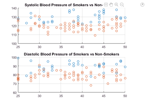
Save and Print Figure
At any point during figure modification, you can choose to save or print the figure for future use.
Click the
 button in the upper-right corner of the
output. This opens the figure in a separate figure window.
button in the upper-right corner of the
output. This opens the figure in a separate figure window.To save the figure — Select File > Save As. For more information on saving figures, see Save Plot as Image or Vector Graphics File or Save Figure to Reopen in MATLAB Later.
To print the figure — Select File > Print. For more information on printing figures, see Print Figure from File Menu.
Note
Any changes made to the figure in the separate figure window are not reflected in the live script. Similarly, any changes made to the figure in the live script are not reflected in the open figure window.